
Moneywise

Rebuilding a financial platform for scale
Moneywise.com is a financial tool and online hub for Canadians to gain the latest in financial news and information. As one of the key products in the growing money pillar, the site is a high revenue earner and a trusted online resource.
Moneywise needed to evolve from a content-heavy comparison site into a cohesive product experience. The brand lacked clarity, the UI lacked consistency, and growth was constrained by fragmented systems.
I led the transformation across brand, product and design systems – aligning research, UX and visual identity into a scalable foundation for growth.
ROLE
Senior Brand & Product Designer
SCOPE
Product
UX/UI
Brand Evolution
Research
Design Systems

Challenge
Moneywise had grown quickly, but without a unified product strategy. Interfaces varied, components were inconsistent, and the brand did not reflect the maturity of the business.
Trust is critical in financial decision-making. The experience needed to feel authoritative, modern and intuitive – without increasing complexity.
OBJECTIVES
Establish a clear product vision and UX framework
Redefine the visual identity to build trust and differentiation
Create a scalable design system for cross-platform consistency
Improve clarity and usability across high-traffic comparison flows

Process
The transformation began with a comprehensive design audit.
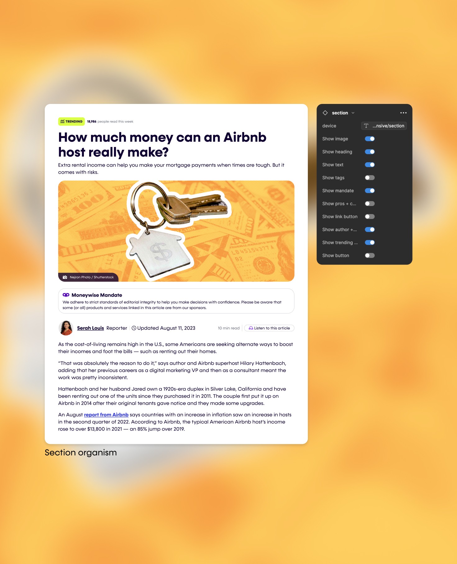
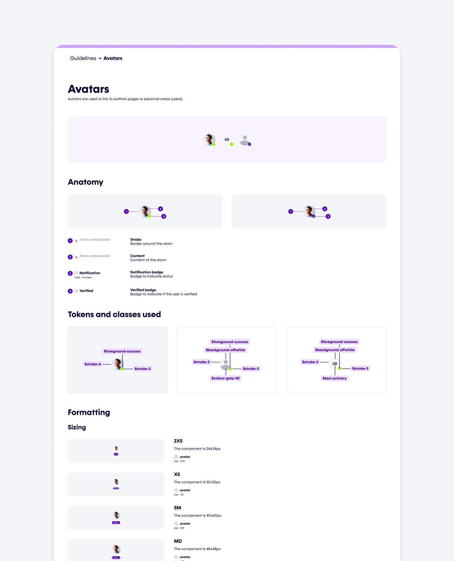
There was no formal design system. Components were duplicated, inconsistent and manually recreated across pages. Patterns had evolved organically, creating visual drift and usability friction.
Before introducing new design direction, we needed structural clarity.
We mapped user journeys, audited UI components at scale, reviewed content hierarchies, and identified systemic inefficiencies across product. The goal was not surface polish – it was architectural stability.
Sprints
UX/UI audit and component inventory
UX framework and brand alignment
Design system creation, documentation and rollout
Process
The transformation began with a comprehensive design audit.
There was no formal design system. Components were duplicated, inconsistent and manually recreated across pages. Patterns had evolved organically, creating visual drift and usability friction.
Before introducing new design direction, we needed structural clarity.
We mapped user journeys, audited UI components at scale, reviewed content hierarchies, and identified systemic inefficiencies across product. The goal was not surface polish – it was architectural stability.
Sprints
UX/UI audit and component inventory
UX framework and brand alignment
Design system creation, documentation and rollout

Solutions
The solution unified brand and product into a cohesive system.
A refined visual identity introduced confidence and clarity. A structured UX framework simplified complex financial comparisons. A modular design system enabled faster iteration and cross-platform alignment.
Key solutions
Refined brand identity and visual language
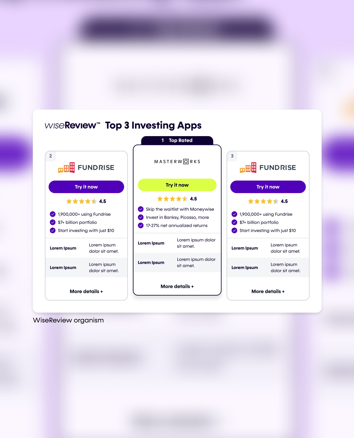
Structured comparison flows for clarity and trust
Modular design system with reusable components
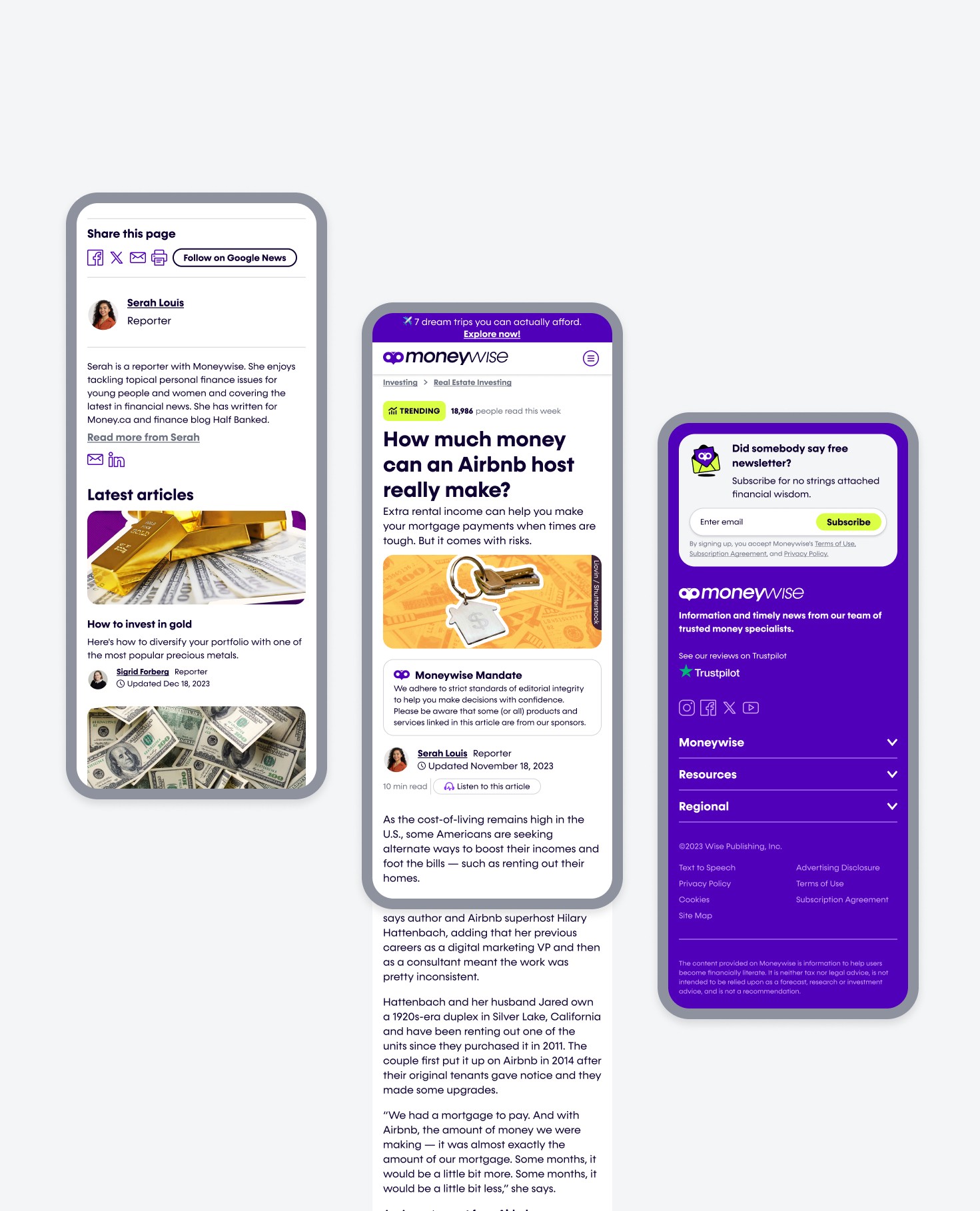
Responsive rollout across web and mobile
Solutions
The solution unified brand and product into a cohesive system.
A refined visual identity introduced confidence and clarity. A structured UX framework simplified complex financial comparisons. A modular design system enabled faster iteration and cross-platform alignment.
Key solutions
Refined brand identity and visual language
Structured comparison flows for clarity and trust
Modular design system with reusable components
Responsive rollout across web and mobile


Outcome
Moneywise shifted from a fragmented experience to a scalable product platform.
The new system reduced design debt, improved usability and created a foundation for continued product growth.
KEY OUTCOMES
Stronger brand differentiation in a competitive market
Increased consistency across product touchpoints
Improved clarity in comparison journeys
Scalable design foundation for future features


Open to product design, design engineering, and creative director roles. Contract and permanent. Sydney and remote.
Mara cheshire
Brand and product designer, design systems builder, and design engineer in progress. 10+ years making digital products that look as good as they work.
Living and working on Wallumettagal land. I pay my respects to elders past, present and emerging.
Mara Cheshire ©2026