
Money.ca

Relaunching a legacy financial platform
Money.ca is a Canadian online destination for personal finance, founded in the 1980s and long embedded in public memory. With a renewed mission to champion financial progress for all, the brand sought to evolve beyond recognition into a modern, scalable platform.
The domain had remained largely stagnant. The product experience no longer reflected contemporary UX standards, nor the ambition to reach and support every Canadian in navigating their financial future.
As Senior Product Designer, I translated research insights into product strategy, restructured key journeys, and crafted a functional brand identity that honoured the legacy while positioning Money.ca for long-term scale.
ROLE
Senior Brand & Product Designer
SCOPE
Product
UX/UI
Brand
Research
Design Systems

Challenge
Money.ca carried decades of brand recognition – but the product had not evolved at the same pace.
The interface reflected incremental updates rather than intentional structure. UX patterns were dated, journeys fragmented, and accessibility considerations inconsistent. Meanwhile, the brand ambition had grown: to support every Canadian in navigating increasingly complex financial decisions.
The challenge was not simply to refresh the visual layer. It was to modernise the experience while preserving trust – building a scalable platform that could support long-term growth and inclusivity.
OBJECTIVES
Translate research insights into clear product direction
Honour legacy brand recognition while modernising its expression
Restructure core financial journeys for clarity and confidence
Improve accessibility and inclusive design standards
Process
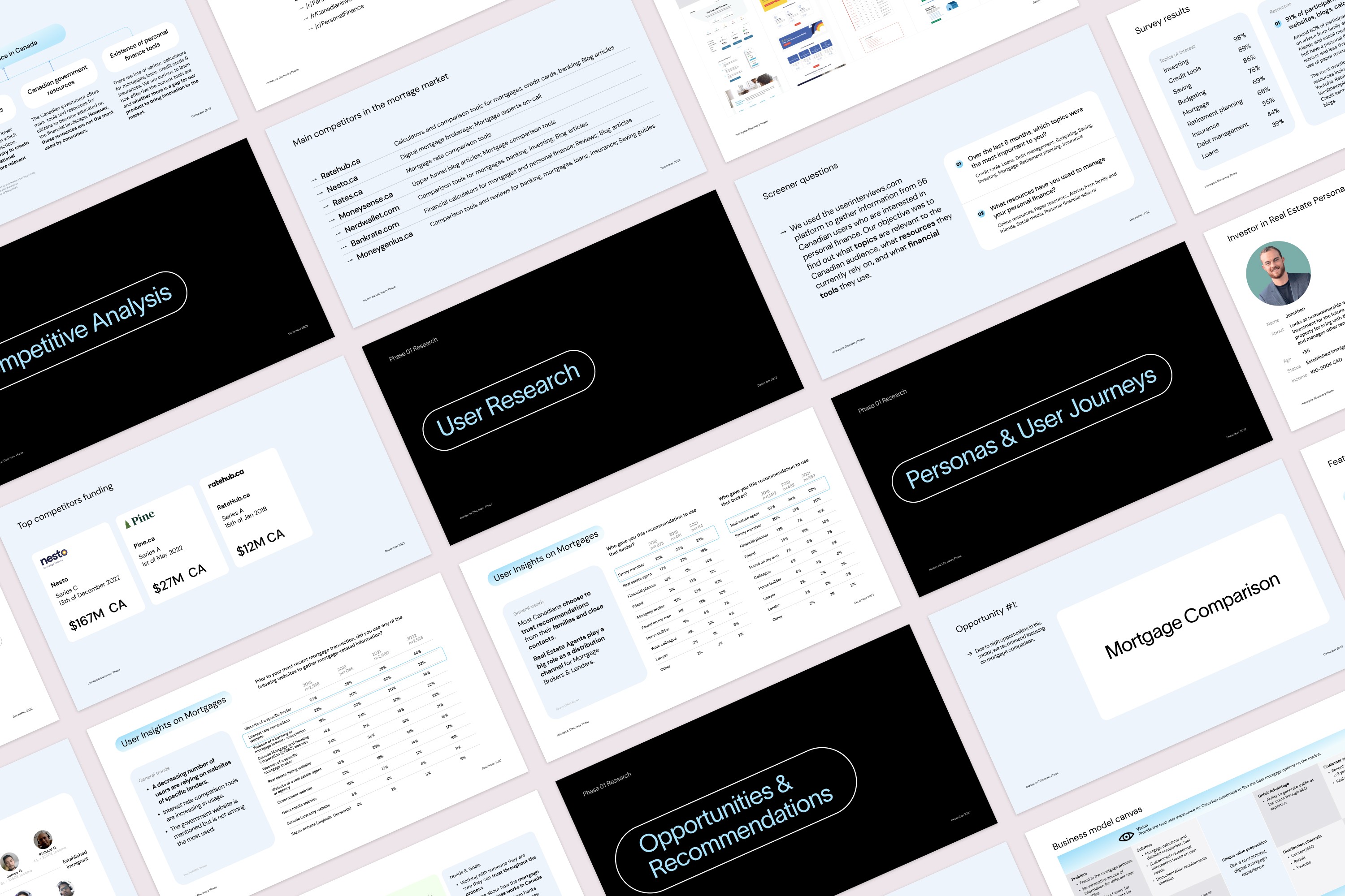
Working alongside external research partners, I synthesised user and market insights into clear experience principles and product direction.
From there, I restructured key financial journeys, simplified navigation, and modernised component patterns to align with contemporary UX standards. In parallel, the brand was evolved to reflect clarity, trust and forward momentum.
The focus was structural – establishing a cohesive foundation capable of supporting long-term scale.
Sprints
Research synthesis and insight translation
UX restructuring and journey simplification
Brand evolution and visual system refinement
Component modernisation and accessibility alignment
Process
Working alongside external research partners, I synthesised user and market insights into clear experience principles and product direction.
From there, I restructured key financial journeys, simplified navigation, and modernised component patterns to align with contemporary UX standards. In parallel, the brand was evolved to reflect clarity, trust and forward momentum.
The focus was structural – establishing a cohesive foundation capable of supporting long-term scale.
Sprints
Research synthesis and insight translation
UX restructuring and journey simplification
Brand evolution and visual system refinement
Component modernisation and accessibility alignment
Solutions
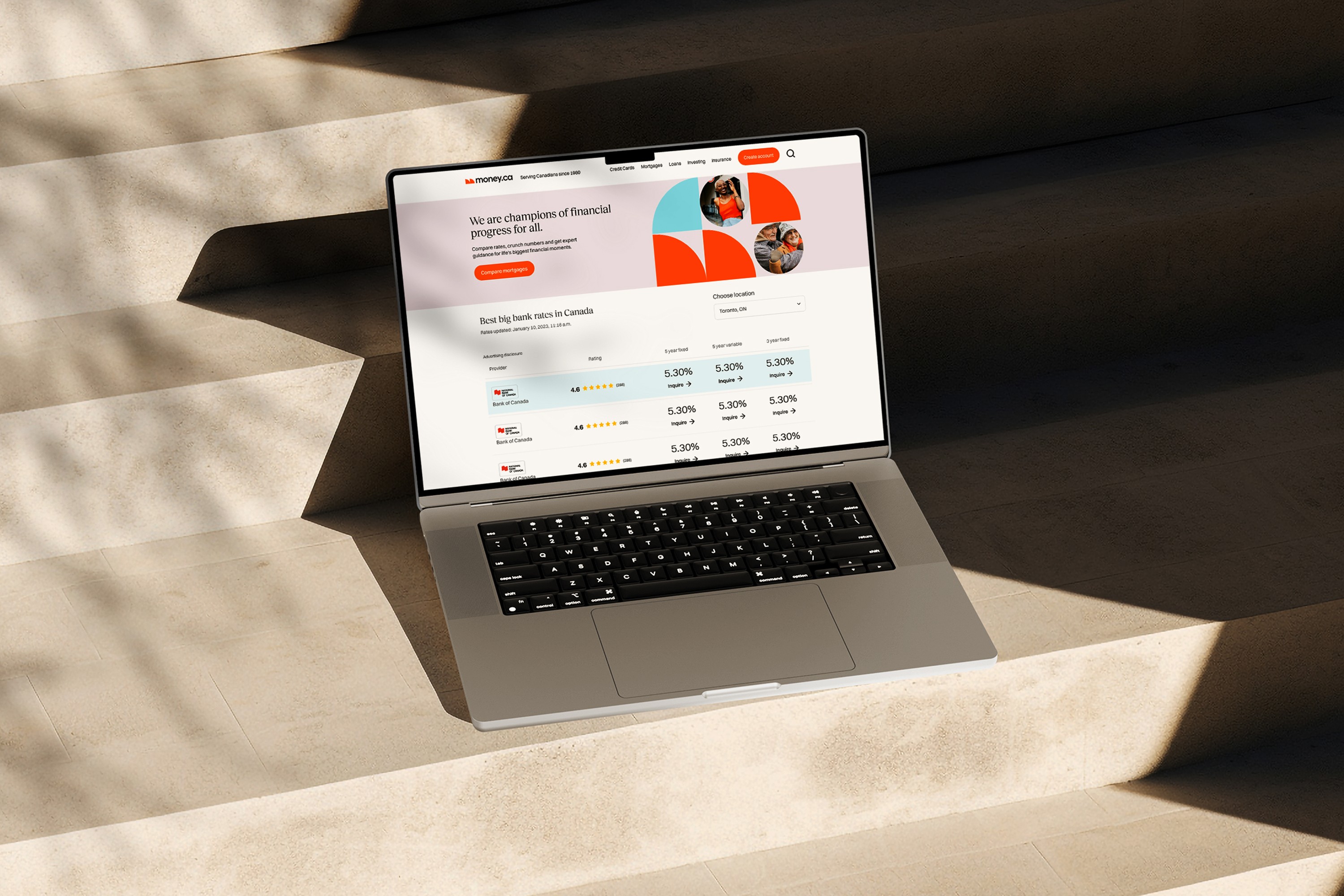
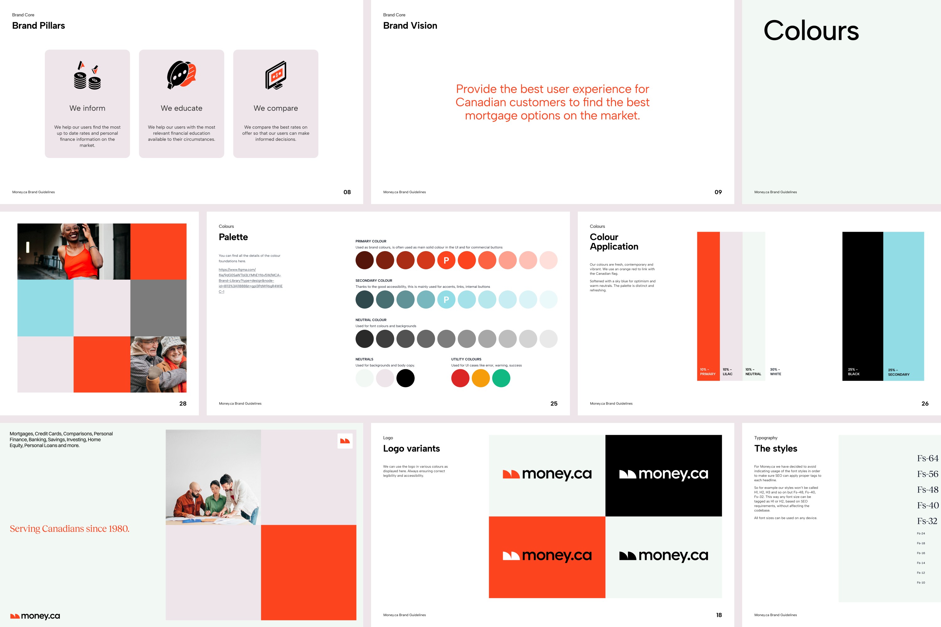
The refreshed Money.ca experience balances legacy recognition with modern clarity – anchored in the brand’s North Star of championing financial progress for all.
A refined identity honoured the original domain while introducing a cleaner, more confident visual language. Core financial journeys were restructured to reduce friction and improve understanding, empowering users to make informed decisions with greater confidence.
Updated component patterns aligned with contemporary UX standards, while accessibility refinements ensured broader usability across diverse financial needs and devices.
Key solutions
Brand evolution aligned to a clear North Star
Restructured journeys supporting confident decision-making
Modernised UI components and interaction patterns
Accessibility-driven improvements across touchpoints
Solutions
The refreshed Money.ca experience balances legacy recognition with modern clarity – anchored in the brand’s North Star of championing financial progress for all.
A refined identity honoured the original domain while introducing a cleaner, more confident visual language. Core financial journeys were restructured to reduce friction and improve understanding, empowering users to make informed decisions with greater confidence.
Updated component patterns aligned with contemporary UX standards, while accessibility refinements ensured broader usability across diverse financial needs and devices.
Key solutions
Brand evolution aligned to a clear North Star
Restructured journeys supporting confident decision-making
Modernised UI components and interaction patterns
Accessibility-driven improvements across touchpoints


Outcome
Money.ca transitioned from incremental evolution to intentional renewal – realigned around its North Star of championing financial progress for all.
The refreshed platform strengthened trust, improved structural clarity, and empowered users to navigate complex financial decisions with greater confidence. Most importantly, it established a scalable foundation capable of supporting the brand’s ambition to reach and serve every Canadian.
KEY OUTCOMES
Research-informed product direction aligned to brand mission
Improved clarity across core financial journeys
Elevated accessibility and inclusive design standards
Scalable foundation for long-term growth


Keep exploring
Keep exploring

Keep exploring
Open to product design, design engineering, and creative director roles. Contract and permanent. Sydney and remote.
Mara cheshire
Brand and product designer, design systems builder, and design engineer in progress. 10+ years making digital products that look as good as they work.
Living and working on Wallumettagal land. I pay my respects to elders past, present and emerging.
Mara Cheshire ©2026